

Trends & Insights
Web Design
Why Responsive Web Design Still Matters
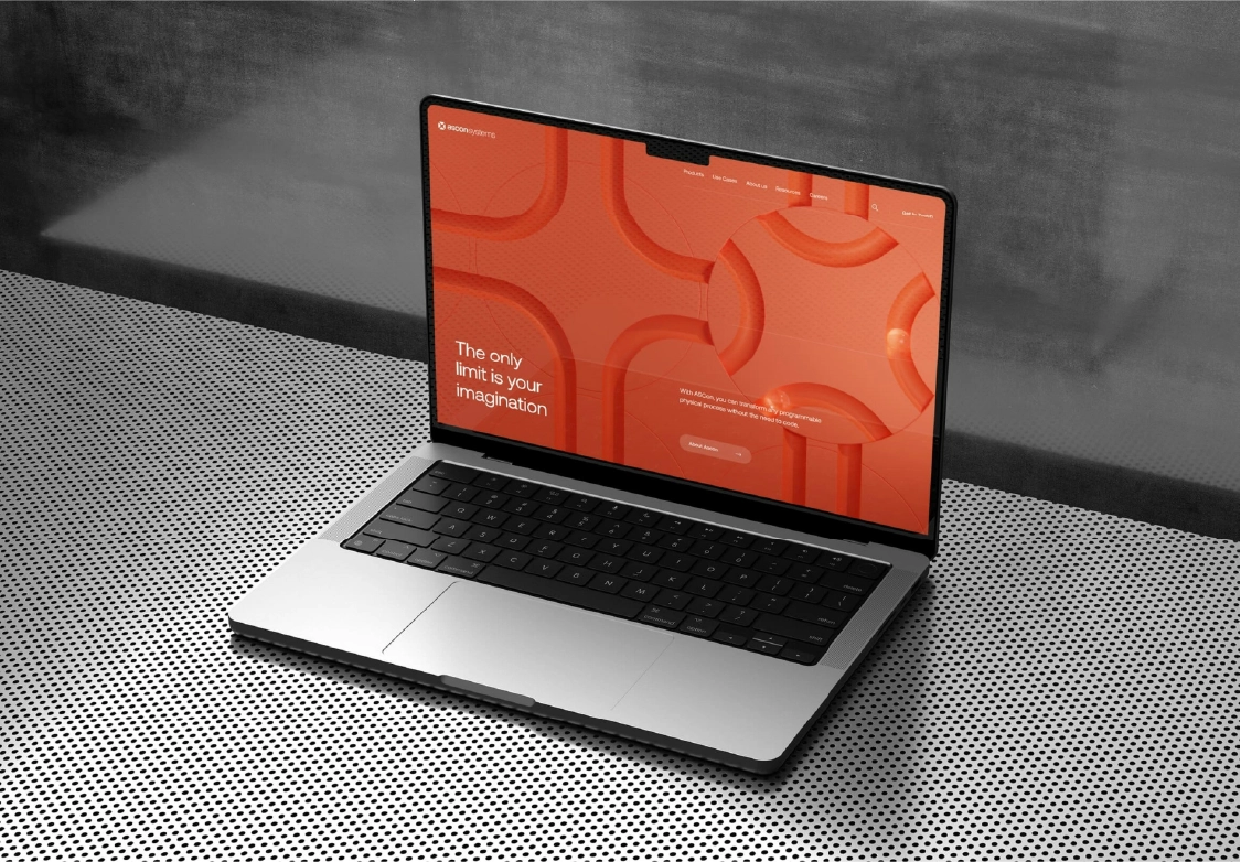
In an era of rapidly evolving devices and screen sizes, responsive web design remains a foundational principle for delivering seamless user experiences. Despite technological advances, the core challenge persists: how to create interfaces that adapt gracefully whether viewed on a smartphone, tablet, or ultra-wide monitor. Today’s top designers are pushing the boundaries by combining fluid grids, flexible images, and intelligent breakpoints with motion and microinteractions that respond to user behavior in real-time.
Accessibility is another critical aspect of modern responsive design. Designers highlighted at the festival how thoughtful typography choices, color contrast, and intuitive spacing can ensure inclusivity for all users. Performance optimization also plays a key role, as faster-loading sites improve engagement and SEO rankings. As user expectations grow, responsive design is evolving from a technical necessity into an art form—one that balances aesthetics, usability, and functionality to create memorable digital experiences.
Organizers recommend newcomers come ready to engage—whether by sharing a current project, giving or receiving feedback, or jumping into lighthearted sketch challenges. The café’s community spirit often leads to unexpected partnerships, freelance gigs, or simply valuable peer support. For many, these mornings are a creative recharge that fuels the rest of their festival experience. So grab your favorite pen and join in; you never know who you might meet or what ideas you’ll unlock.
Stay tuned for more updates and behind-the-scenes highlights from this year's Design Festival by signing up for our newsletter.